Design'in
Basically, we are learning what a magazine needs to be look like. But First: Indesign.
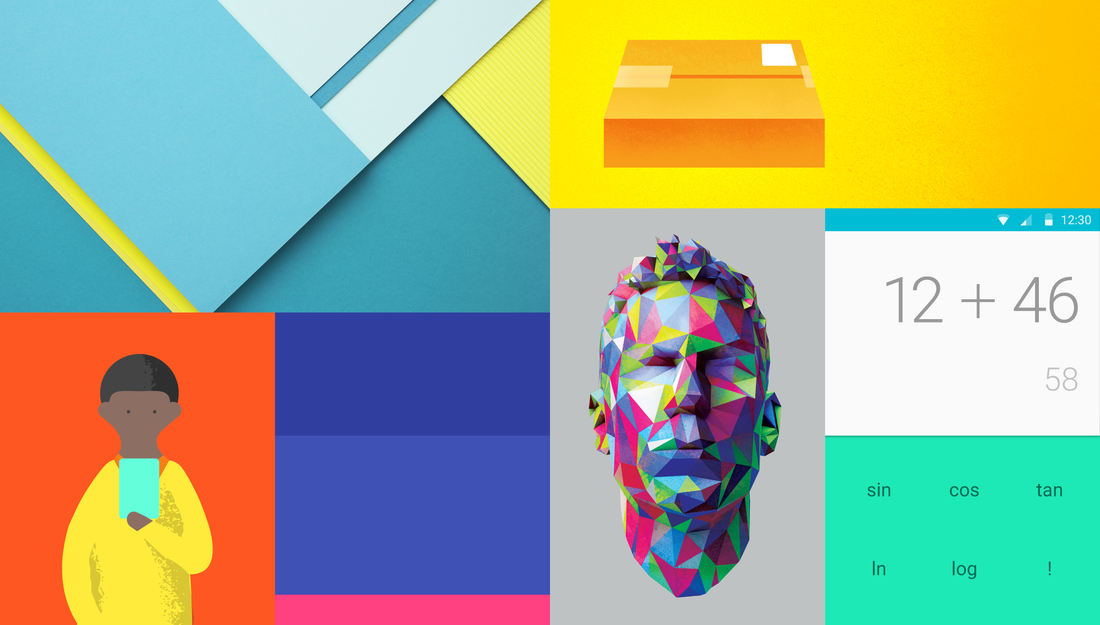
Inspiration from Google's Material Design.
Google's Materialistic look is what I call godlike. Everything that Google owns now is materialistic. The design was released when Lollipop was coming out, Android 5.0
" The visual details are delightful, and the paradigmatic underpinnings — that interfaces are three-dimensional constructions, composed of layers of “physical” components — are refreshingly novel. But I’ll spare you more “oohs” and “aahs” over the language’s use of bright colors, large images, and depth. If we take anything from Material Design it isn’t how to use color, how your ease timing should be set,or what the resting elevation of an object should be. It’s not the details themselves we take away, it’s how the details combine to create purposeful brand experience. "
- Wired Magazine (Nathan Sinsabaugh)
Magazine Covers. Minimalistic Inspirations.
Minimalistic Designs. Typography. Stripes. Posters. Inspirational. Work. Films. Neat.
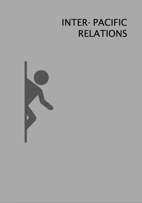
Inter-Pacific Relations - First Indesign Project.
This was the first project that we had created in Indesign. Mr. Redd Caruana instructed us on how to create our first 4-page Indesign magazine. I am quite familiar with what adobe shortcuts are, and how the programs work, so I was pretty quick on the technicalities that the Adobe software uses. In this case, it was very similar to Photoshop, you have a layout with guidelines, and your image needs to fit in those guidelines.
Content was made just for fun and for not intentional-use.
Content was made just for fun and for not intentional-use.
|
|
|
Classwork.
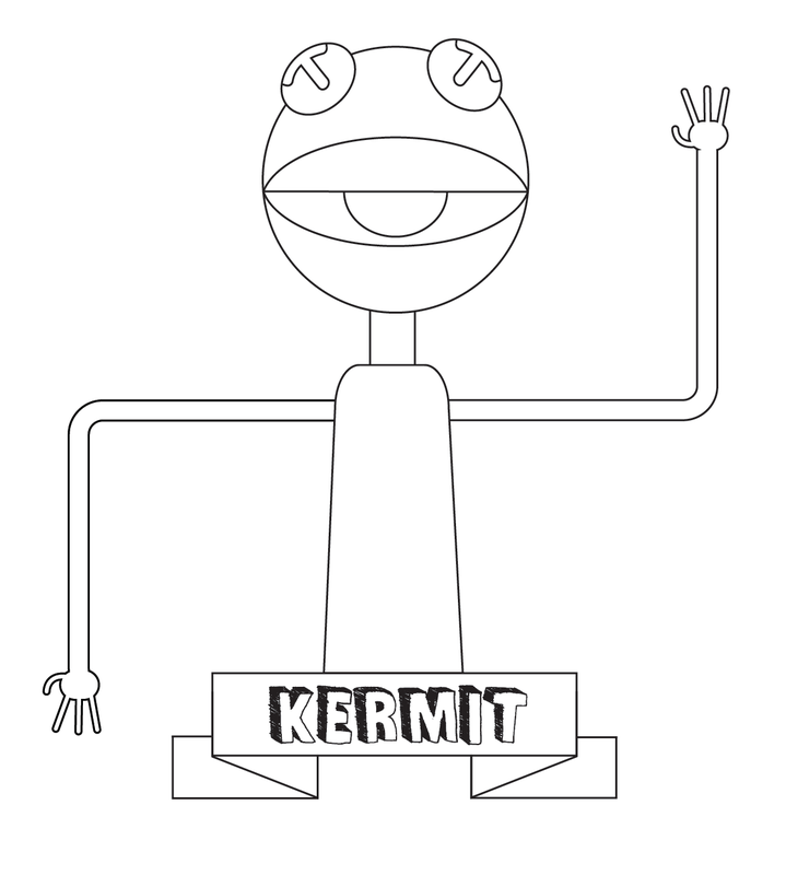
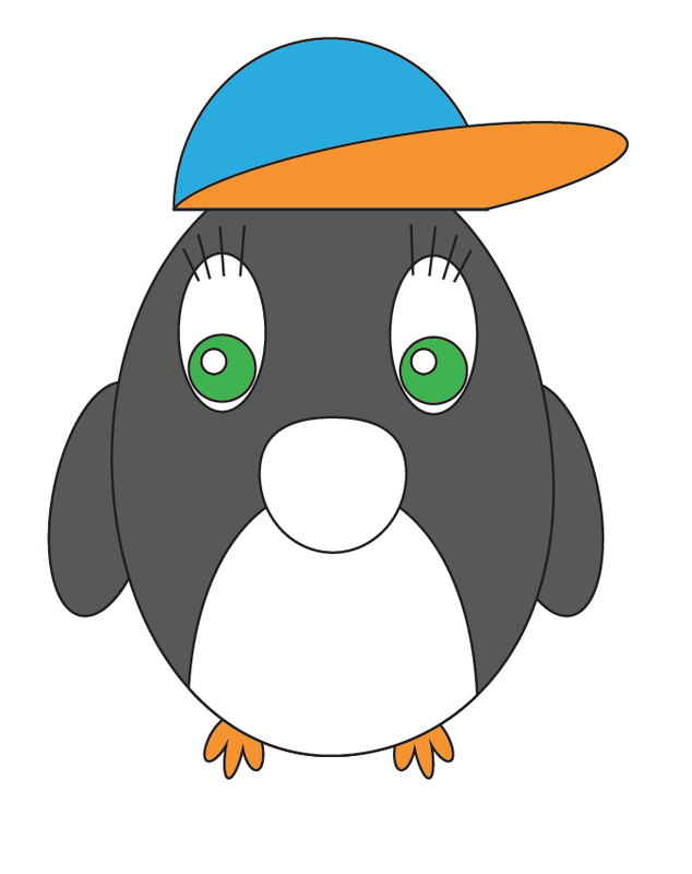
These were some Vector images that we have created during class. They were done using Adobe Illustrator. These were done step by step with the help of the teacher to guide us using some techniques and tricks of Illustrator. Kermit was done using a lot of rectangles and ellipses. The shapes were either joined together or united together.
|
|
|
|
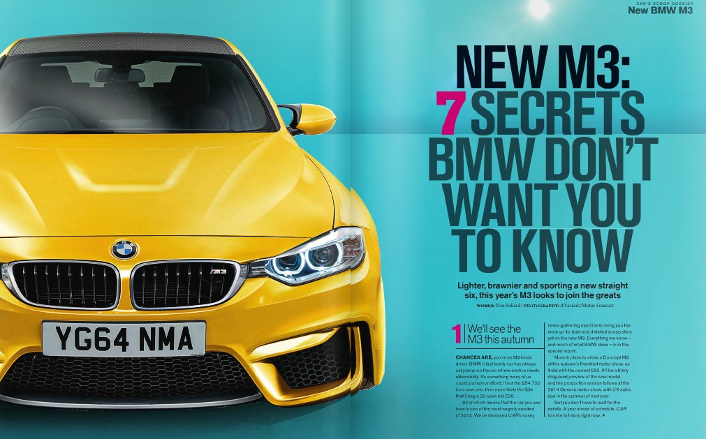
I was greatly inspired from this magazine as I really liked the colours used and how the text is very bold and striking against the colours. Also, the numbers, 7 & 1 are used in pink, as each "Secret" in the article is referred to by the same number so it will be more organised. |
|
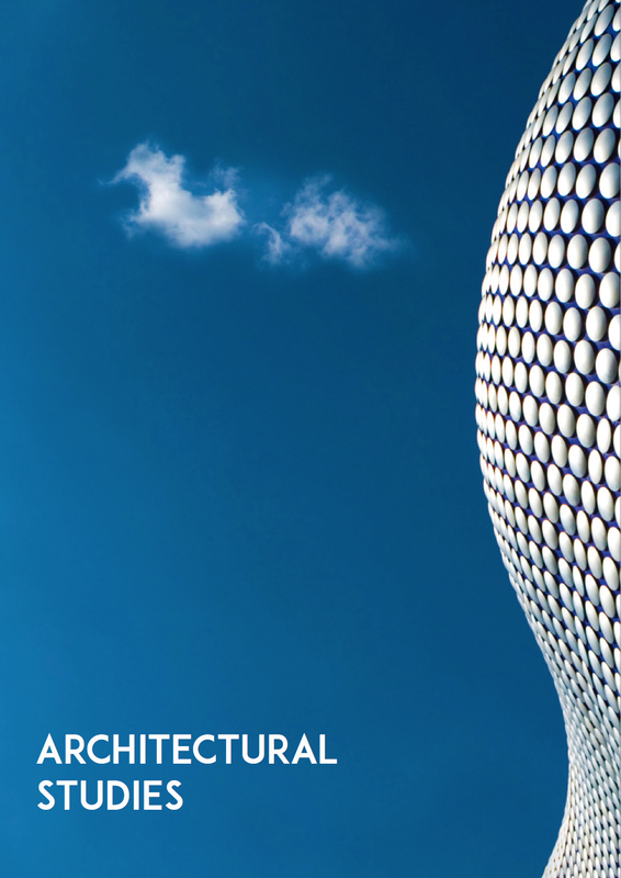
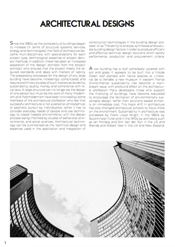
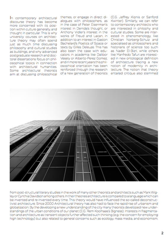
ARCHITECTURAL TASK
This was a class task where we had to design our first creatively made article via InDesign. We had to choose a random topic and insert unrelated text to the 2-page article, with a front cover. I really liked this task as it led me to researching more about magazine layouts and how professional magazines are done. This type of magazine that my article was in is very professionally made, and had to do with architecture. Architectural magazines often include minimal designs and had empty pages with blobs of 1-page images, where new concepts of designs and buildings were transformed into pieces of art.
I love black and white images and architectural sites are amazingly stunning when taken at bright daylight and converted into black and white. When seen in black and white, the lines transform and become guide lines to where the eye must first look. Also, as a cover photo, I like minimalism and eye catching images.
I love black and white images and architectural sites are amazingly stunning when taken at bright daylight and converted into black and white. When seen in black and white, the lines transform and become guide lines to where the eye must first look. Also, as a cover photo, I like minimalism and eye catching images.
|
|
|
VECTOR GRAPHICS IN MOVING IMAGE
The images below are Lower thirds created for news and programs, which are a way of pointing headlines to the audience without repeating them over and over by speech. Lower thirds are normally placed at the bottom, and used in every news room. Lower thirds come in different shapes and sizes and colours. Some news stations prefer to hold with their colour scheme and others prefer to be creative and design their own lower thirds.

|
|
VECTOR GRAPHICS IN RASTER IMAGES
These images show examples of a raster image, taken with a DSLR, and added Vector graphics from Illustrator. The left image is a still raster image of a door knob. The right image is half-vector half-raster kind of graphic. Vector graphics were added on top of her face. I like this concept, low-poly art.

|

|
This is an example of a lower third vector graphic, placed in the lower thirds of the photo. It tells what the picture is about and what is going on. Lower thirds are also known as captions, as they accompany what is being said or done.
SHOWREEL EDITING
This is the process shown that was used to organise, edit & export my work. Premiere Pro CC 2014 was used.
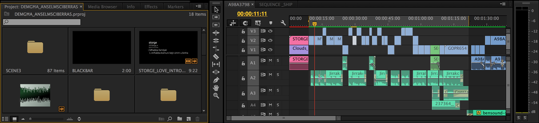
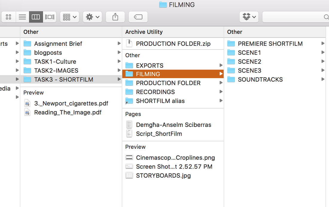
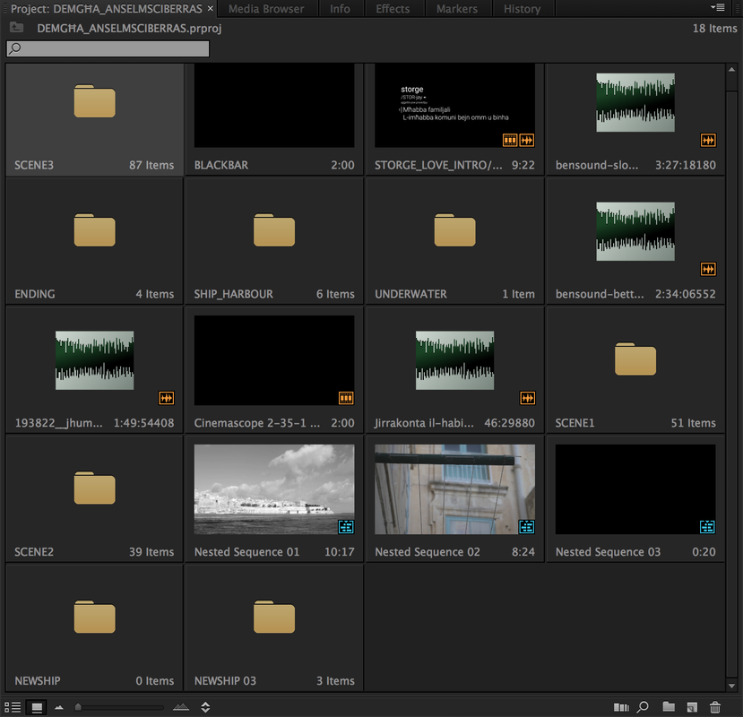
FILE MANAGEMENT
This is the first part that I got to sort out. I created different folders in the file manager and in Premiere. In the folders i created subfolders, like in the file named 'FILMING'. There are different subfolders for each scene that I filmed. This makes the work easier as I will know that the footage in scene 2 has nothing to do with scene 3. This is organising work. In Premiere the same structure system is included. I have created different folders for each scene and effect. I have even created a folder for the 'SHIP' part. There are photoshop files in that folder. Those photoshop files are linked to Premiere, so any changes that are made, Premiere recognises them and changes immediately.
|
|
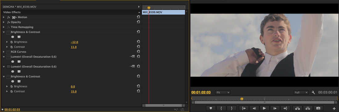
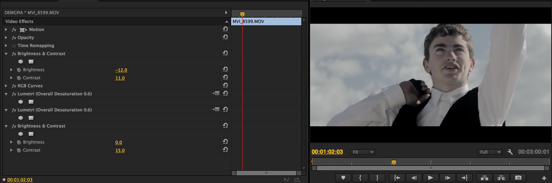
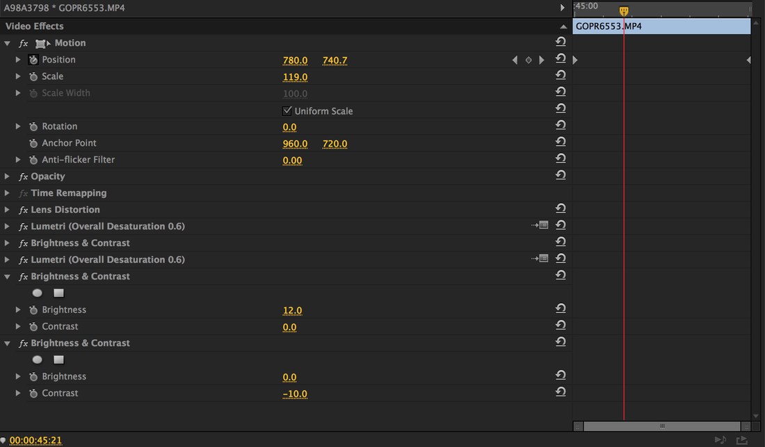
IMAGE ADJUSTMENTS
This is one of the many Image Adjustments that I created. The images below are the before and after, respectively. The most important effect in my short film was the Overall Desaturation. This is because my film has a sad tone, thus, I decreased the colours to make the image feel less lively.
Premiere has a lot of effects that can be used by dragging and dropping on the selected clip.
Premiere has a lot of effects that can be used by dragging and dropping on the selected clip.
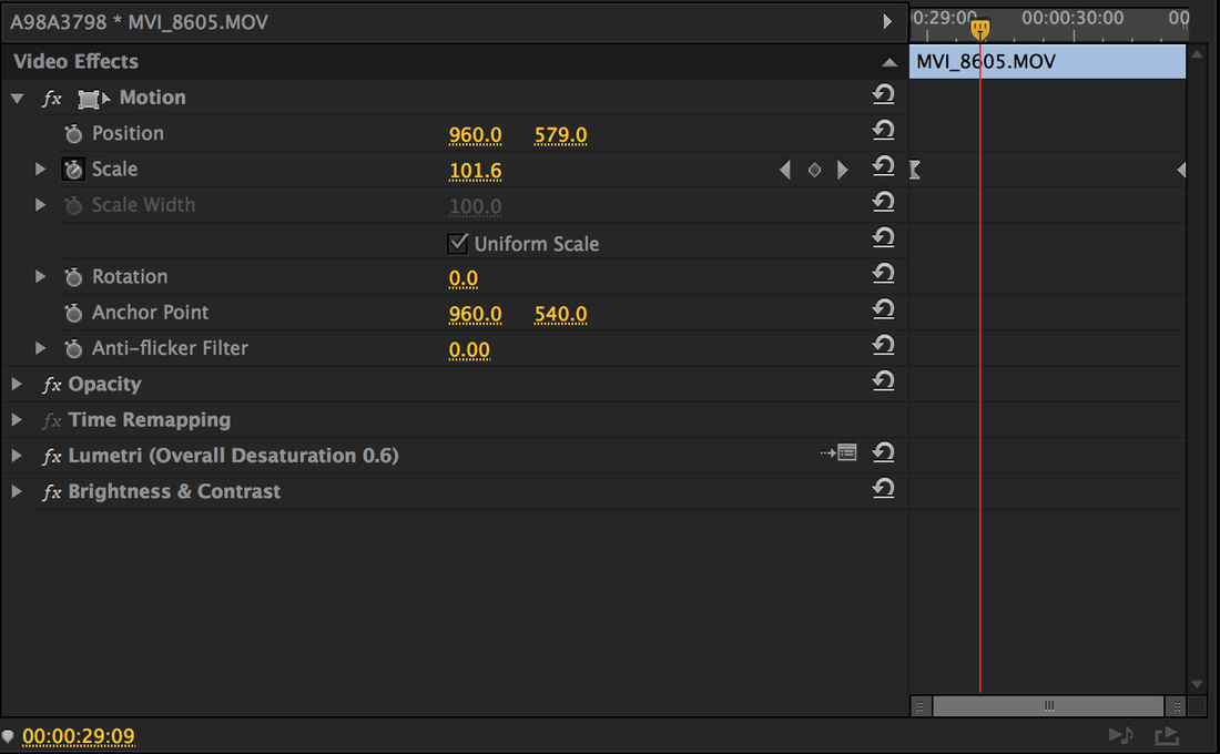
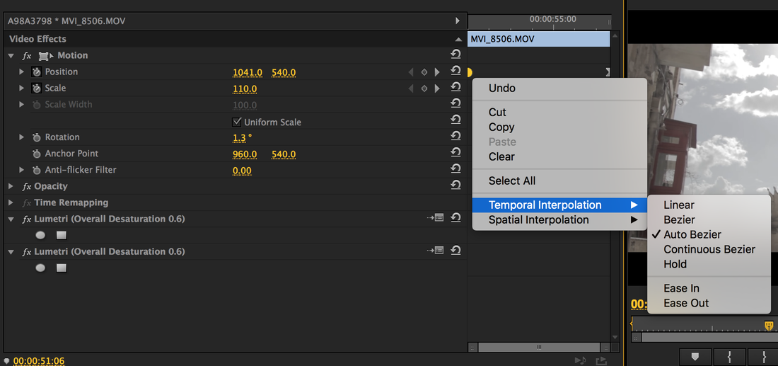
KEYFRAMES - ZOOMS & PAN
These are some zooms and motion keyframe adjustments. I created keyframes for the video clips to make them look like a pan from left to right, or tilt up or down. The Temporal Interpolation keyframe adjustments were made to make the movement smoother.
|
|
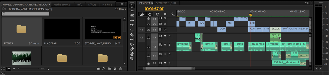
SEQUENCE
This is the were all the clips are put on a timeline. A sequence can be named and exported to the desired format of video. There might be a case where a sequence is inside a sequence. This may be the case when editing an After Effects file, or a Photoshop image onto an MOV file, and one creates a sequence to make the workflow easier and organised.